
Effective website design and user experience for small businesses is not mainly about visual trends. It is about helping the right visitor understand the offer, trust the business, find the information they need, and complete a useful action without unnecessary effort.
A polished website can still fail when navigation is confusing, pages load slowly, important details are hidden, or forms create friction. Conversely, a clear and credible site can outperform a more decorative competitor because it respects the customer’s time and supports confident decisions.
This guide explains how to plan, design, test, and improve a business website around real users and measurable outcomes. It covers strategy, information architecture, content, accessibility, mobile experience, performance, conversion, and continuous optimization.
Start With the Website’s Business Role
Define what the website must accomplish before discussing colors or layouts. An ecommerce store needs profitable purchases. A professional service firm may need qualified consultations. A restaurant may prioritize reservations, directions, menus, and calls. A software company may need trial registrations or demo requests.
Choose a primary conversion for each important page and identify supporting actions. A service page may lead to a quote request, while a guide may encourage a newsletter signup or direct the reader to a relevant service. This clarity prevents pages from competing for attention with too many equally prominent buttons.
Document commercial constraints as well: average customer value, sales cycle, common objections, geographic limits, operational capacity, and legal requirements. Design decisions should reflect the reality of how the business serves customers.
Understand Users Before Designing
Talk to customers and the people who speak with them every day. Review sales calls, support tickets, form submissions, reviews, analytics, search queries, and frequently asked questions. Learn what visitors are trying to achieve, what they already know, which risks concern them, and what evidence helps them decide.
Create short profiles for priority user groups. Include their goals, context, questions, constraints, preferred devices, and likely entry pages. Avoid fictional detail that does not influence the design. A useful profile helps the team decide what information belongs on a page and how quickly it must be available.
Map the Customer Journey
Visitors may discover the site through search, an advertisement, social media, a referral, or a direct brand query. Each source creates different expectations. Map the steps from arrival to decision, including comparison, validation, contact, purchase, confirmation, and follow-up.
Look for moments where uncertainty grows. Customers may need pricing context, service boundaries, delivery details, availability, qualifications, guarantees, or examples before they act. Address these questions in the journey rather than forcing everyone to contact the business for basic information.
Create Clear Information Architecture
Information architecture determines how content is grouped, labeled, and connected. Start with the tasks users need to complete, then organize pages around recognizable categories. Navigation labels should describe destinations plainly. Clever labels make users pause, and every unnecessary pause adds friction.
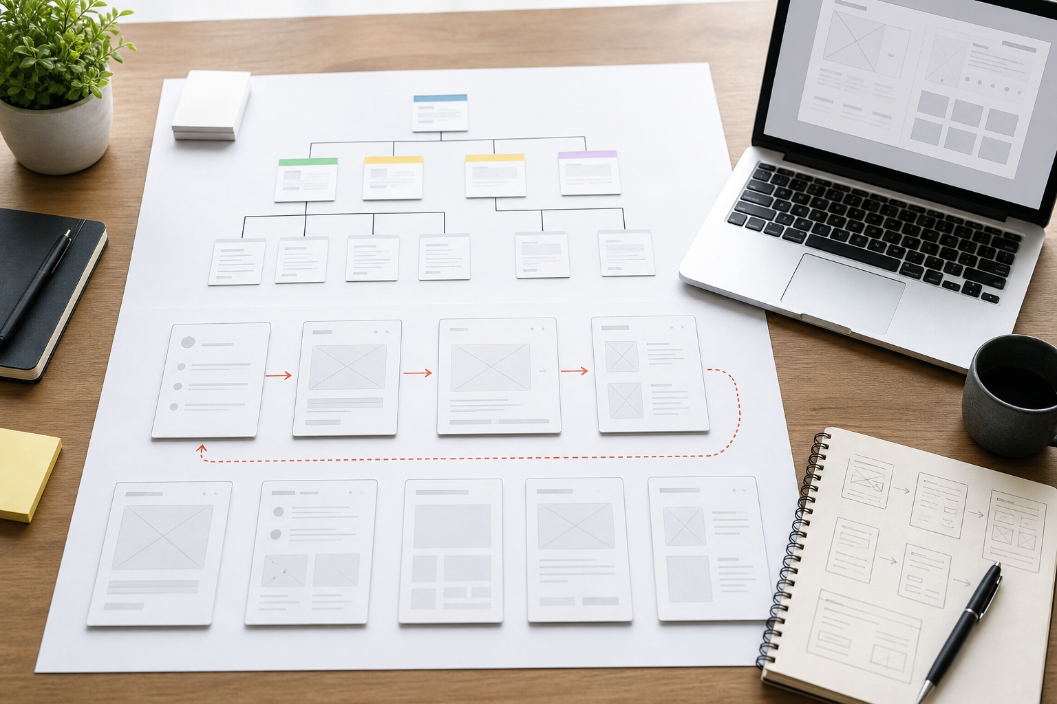
Keep the primary navigation focused on the most important sections. Use secondary navigation, footer links, filters, and contextual links for supporting material. Larger sites benefit from breadcrumbs and a useful search function. Test whether people can predict where a link will take them before clicking.
Every important page should have a logical home and a clear path onward. Internal links help users compare related options and also help search engines understand the structure. Avoid isolated pages that can be reached only through a direct URL.
Design Pages Around a Visual Hierarchy
Visual hierarchy tells the visitor what matters first, second, and third. Use size, spacing, contrast, alignment, and placement to guide attention. A page should communicate its purpose within moments: what is offered, who it helps, and what the visitor can do next.
Use headings to organize meaning rather than simply enlarge text. Keep line lengths comfortable, create adequate spacing, and break complex material into sections. Buttons should look interactive and use specific labels such as “Request a Quote” or “View Pricing” instead of vague text.
Consistency lowers cognitive effort. Reuse patterns for navigation, cards, forms, alerts, and calls to action. Consistency does not require monotony; it creates a dependable foundation on which important differences can stand out.
Write Content for Decisions
Good website copy answers the questions that block progress. Begin with the customer’s need, explain the offer in plain language, and support claims with credible detail. Replace broad statements such as “best service” with proof: process, experience, response times, qualifications, customer results, transparent policies, or relevant examples.
Use short paragraphs and descriptive headings, but do not remove important information merely to create a minimal appearance. Visitors need enough substance to decide. Layer information so key points are easy to scan and deeper details remain available.
Design Mobile First in Practice
Responsive design is more than shrinking a desktop layout. On a phone, users may have limited time, slower connectivity, one-handed interaction, and a smaller view of the page. Prioritize essential content, use large tap targets, avoid crowded controls, and keep important actions within easy reach.
Test menus, forms, filters, tables, image galleries, popups, and payment flows on real devices. Ensure the page does not jump unexpectedly as media loads. Do not hide important information on mobile simply because space is limited; reorganize it.
Make Accessibility a Core Requirement
Accessible design enables more people to use the website and usually improves the experience for everyone. Provide sufficient color contrast, keyboard access, visible focus states, descriptive labels, meaningful link text, and correctly structured headings. Add useful alternative text to informative images and captions or transcripts to media where needed.
Do not rely on color alone to communicate errors or status. Forms should explain what went wrong and how to fix it. Modal dialogs, menus, and interactive widgets need sensible focus behavior. Automated scans help find some issues, but manual keyboard checks and testing with assistive technology reveal more.
Build Forms That Respect Users
Ask only for information necessary at that stage. Every field creates effort and raises a privacy question. Use clear labels above inputs, mark required fields consistently, preserve entered data after an error, and validate in a helpful way. Show formatting examples when needed.
After submission, confirm what happened and explain the next step. Tell users when they can expect a response, provide a reference where appropriate, and offer an alternative contact route. A vague success message can leave someone unsure whether the form worked.
Test Usability With Real People
Usability testing does not require a large laboratory. Give representative users realistic tasks and watch where they hesitate, misunderstand labels, backtrack, or fail. Ask them to think aloud without teaching them how the interface works. Five thoughtful sessions can expose repeated problems that the internal team no longer notices.

Test early wireframes before expensive development, then test the working site before launch. Include mobile devices and important assistive scenarios. Record evidence, prioritize problems by severity and frequency, and retest after changes.
Improve Website Performance
Speed affects usability, conversion, and search visibility. Optimize images, serve appropriate dimensions, reduce unnecessary scripts, use effective caching, and choose reliable hosting. Load noncritical resources carefully and monitor third-party tools that add substantial weight.
Measure real user experience as well as laboratory tests. A fast homepage does not help if the product or checkout pages are slow. Track important templates across mobile connections and investigate sudden regressions after plugin, design, or advertising changes.
Design for Trust
Visitors look for signals that a business is legitimate and capable. Display accurate contact information, real photographs, clear policies, secure connections, relevant credentials, honest testimonials, and current content. Explain who is responsible for the service and what customers can expect.
Avoid fake urgency, hidden costs, misleading buttons, preselected extras, and difficult cancellation paths. These dark patterns may create short-term actions but damage trust, reputation, and customer lifetime value.
Optimize Conversion Without Manipulation
Conversion optimization removes obstacles between a legitimate need and a useful outcome. Begin by checking whether the offer is relevant, the message is clear, and the page provides enough proof. Then examine navigation, calls to action, forms, page speed, mobile behavior, and follow-up.

Use analytics to find drop-off points, but combine numbers with session observations, customer interviews, support feedback, and usability tests. A low conversion rate may reflect unclear pricing, poor traffic quality, an operational limitation, or a technical problem. Do not assume a button color is the answer.
Run Meaningful Experiments
Write a hypothesis that connects a user problem to a measurable change. For example: “Clarifying installation costs near the main offer will reduce uncertainty and increase qualified quote requests.” Test one meaningful concept where possible, define the primary metric, and monitor guardrails such as lead quality or refunds.
Small websites may not receive enough traffic for formal split tests. In that case, use moderated usability sessions, customer feedback, before-and-after comparisons, and longer observation periods. Evidence can still improve decisions without pretending to have statistical certainty.
Measure Website UX
Track task success, conversion rate, form completion, error frequency, search usage, navigation paths, page performance, support contacts, qualified leads, sales, and customer satisfaction. Segment by device, traffic source, page type, location, and new versus returning users where useful.
A single metric can mislead. A shorter time on page may indicate that users found an answer quickly or that they gave up. Combine behavioral data with direct feedback and business outcomes. Annotate redesigns and major content releases so changes can be evaluated responsibly.
A Practical Website Improvement Plan
Days 1–30: Diagnose
Define goals, audit analytics, interview customers, test key tasks, review mobile pages, scan accessibility, and measure performance. Identify the highest-impact obstacles on pages closest to revenue.
Days 31–60: Fix fundamentals
Simplify navigation, clarify page messages, repair forms, improve mobile interaction, compress media, strengthen trust signals, and resolve serious accessibility issues. Test the complete conversion journey.
Days 61–90: Validate and refine
Run usability sessions, compare qualified outcomes, improve weak pages, and test one meaningful hypothesis. Create design and content standards so future updates preserve quality.
Common Website Design Mistakes
- Designing around internal preferences instead of user tasks.
- Using vague navigation and calls to action.
- Prioritizing decoration over clarity and speed.
- Hiding useful details to make pages look minimal.
- Treating mobile as a smaller desktop layout.
- Ignoring accessibility until the end of a project.
- Requesting unnecessary information in forms.
- Launching without usability and conversion testing.
Frequently Asked Questions
How often should a business website be redesigned?
Redesign when evidence shows that the structure, technology, brand, or user experience no longer supports business needs. Continuous improvements are often safer than replacing the entire site on a fixed schedule.
What is the difference between UI and UX?
User interface design focuses on the visual and interactive elements people use. User experience covers the broader journey, including usefulness, clarity, accessibility, performance, emotion, and success in completing a task.
How many pages does a small business website need?
It needs enough pages to explain important services, serve distinct customer intents, establish trust, and support conversion. Quality and clear purpose matter more than an arbitrary total.
Final Thoughts
Strong website design and user experience for small businesses begins with empathy and ends with measurable improvement. Understand the visitor, organize information clearly, communicate honestly, make every device usable, and remove barriers from important tasks.
The best website is not the one with the most effects. It is the one customers can understand, trust, and use with confidence. Treat the site as a living business system, learn from real behavior, and improve it steadily.