
Marketing reports often look impressive while leaving the most important question unanswered: what should the business do next? A useful dashboard is not a collection of every number a platform can export. It is a focused decision tool that connects commercial goals, customer behaviour and marketing activity. For a small business, that distinction matters. Time is limited, budgets are tight, and a misleading metric can send weeks of work in the wrong direction.
This guide explains how to build a marketing dashboard that supports real decisions. It covers goal setting, KPI selection, data quality, reporting frequency and interpretation. The aim is not to create the most complicated report. It is to build a repeatable system that helps owners and marketing teams see what is working, identify what needs attention and decide where the next pound or hour should go.
Start with decisions, not available data
Most analytics projects begin in the wrong place. Someone opens an advertising account or analytics platform, sees dozens of charts, and copies them into a report. The result may contain sessions, impressions, clicks, engagement rates, device splits and page views, but it rarely reflects the decisions the business actually faces.
Begin by listing the questions that recur in planning meetings. Which channel brings enquiries that turn into customers? Are we attracting the right audience? Which services generate profitable demand? Where do prospects leave the journey? Should we increase, reduce or redirect spend? A dashboard becomes valuable when every section helps answer one of these questions.
For each question, name the person who will act on the answer. An owner may need a monthly view of qualified leads, revenue and acquisition cost. A content manager may need weekly organic landing-page performance and conversion paths. A paid media specialist may need campaign-level spend, conversion quality and search-term signals. One report can serve several people, but it should make their different decisions clear.
Connect business goals to measurable outcomes
A goal such as “grow online” is too vague to measure. Translate broad ambition into an outcome with a timeframe and a commercial meaning. For example, a local service business might aim to increase qualified consultation requests from organic search by 25 percent over six months while maintaining its current close rate. An ecommerce company might focus on increasing repeat-purchase revenue without raising discount dependence.
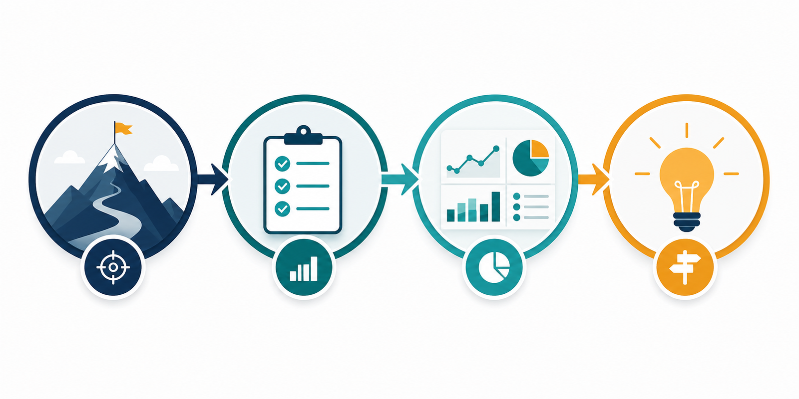
Then create a simple measurement chain:
- Business objective: the commercial result the organisation wants.
- Customer action: the behaviour that indicates progress toward that result.
- KPI: the primary measure used to judge progress.
- Diagnostic metrics: supporting numbers that help explain why the KPI moved.
- Decision: the action the team may take in response.
Suppose the objective is to win more profitable projects. A form submission alone is not enough. The relevant KPI may be sales-qualified leads, supported by landing-page conversion rate, source, service selected, response time and close rate. This chain prevents the dashboard from rewarding activity that does not help the business.
Choose a small set of KPIs
A KPI is a measure with strategic importance, not simply a number that changes. If everything is labelled a KPI, priorities disappear. Most small-business dashboards need only a handful of primary indicators. The exact set depends on the business model, but a balanced view commonly includes acquisition, engagement, conversion, value and retention.
Acquisition measures show whether relevant people are arriving. Useful examples include qualified organic traffic, non-brand search visibility, local discovery actions and cost per relevant visitor. Engagement measures show whether the experience matches intent. Examples include meaningful content consumption, product exploration or progression to a high-intent page. Conversion measures capture enquiries, calls, bookings, purchases or another defined outcome. Value measures connect those actions to pipeline, revenue, margin or customer lifetime value. Retention measures reveal repeat purchases, renewals, referrals or churn.
Avoid choosing metrics merely because they are easy to improve. Impressions can grow while leads decline. Traffic can rise because an article ranks for an irrelevant informational query. A low advertising cost per lead can hide poor lead quality. The KPI should remain close enough to commercial value that an apparent improvement is genuinely useful.
Separate outcomes from diagnostic metrics
Outcome metrics tell you what happened. Diagnostic metrics help explain why. Revenue, qualified leads and bookings are outcomes. Click-through rate, page engagement, form starts and speed are diagnostic. Both belong in reporting, but mixing them without hierarchy makes a dashboard hard to read.
Place the core outcomes at the top. Under each one, show two or three diagnostic indicators that can explain a change. If organic enquiries fall, supporting data might reveal that rankings remained stable but conversion on a key service page declined. If paid acquisition cost rises, diagnostics may show stronger competition, a weaker click-through rate or a reduction in sales acceptance. The report should guide investigation rather than invite random interpretation.
Define every metric before building the dashboard
Teams often use the same word to mean different things. One person counts every form completion as a lead; another counts only valid prospects; the sales team counts only opportunities. These definitions produce conflicting reports even when every system is technically accurate.
Create a short measurement dictionary. For each metric, record its definition, source, calculation, owner, reporting frequency and known limitations. Define what makes a lead qualified, how duplicate submissions are treated, which calls count, what attribution window is used and how cancelled orders affect revenue. This document does not need to be elaborate. Its value comes from removing ambiguity.
Definitions should also reflect consent and privacy requirements. Collect only the information needed for a legitimate purpose, control access, and avoid exposing personal details in dashboards. Aggregated reporting is usually more useful for decision-making than a table containing individual customer data.
Build a reliable data foundation
A polished dashboard cannot repair unreliable inputs. Before automating a report, test the customer journey yourself. Submit forms, click telephone links, complete a test purchase where appropriate, and confirm that events appear once with the correct source information. Check whether internal visits, spam submissions and payment failures distort the figures.
Use consistent campaign naming. Without a clear convention for source, medium and campaign parameters, traffic fragments into confusing variations. Connect marketing data to customer relationship or sales records when possible, because platform conversions do not reveal whether a lead was suitable or profitable. Even a simple monthly reconciliation between enquiries and accepted opportunities can improve decision quality.
Record major business and marketing changes alongside the data. A site redesign, pricing change, tracking update, seasonal promotion, stock issue or staff shortage can alter performance. An annotation prevents future readers from inventing explanations for a movement that had an obvious operational cause.

Design the dashboard for quick understanding
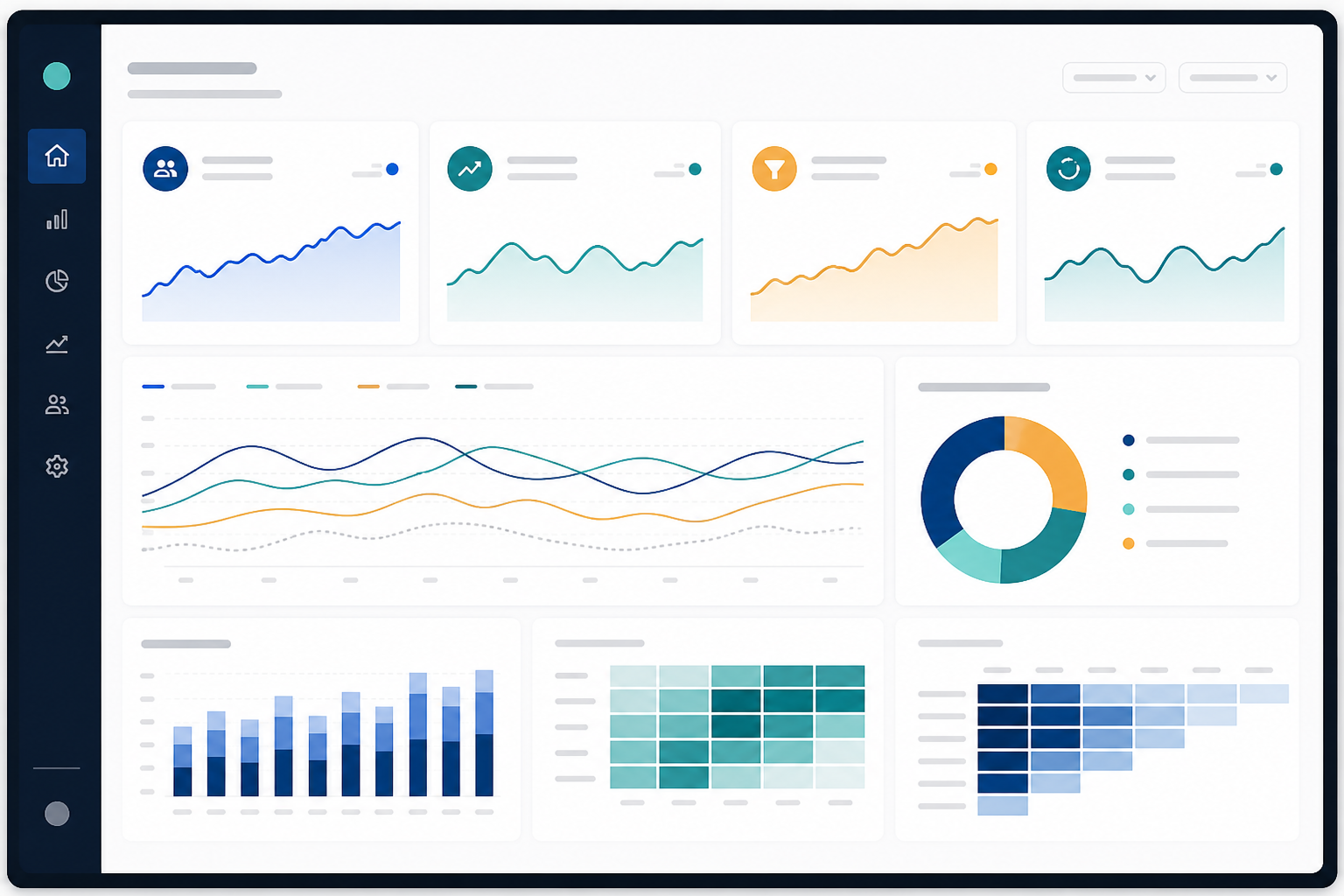
A decision-maker should understand the main story within a minute. Start with a compact summary showing the selected period, core outcomes, comparison period and progress toward target. Use consistent colours and formats. A percentage should not become a decimal in another section, and a currency figure should not change units without a clear label.
Use charts only when they make a pattern easier to see. A line chart works well for trends over time. Bars help compare channels or services. A table is often best when exact values matter. Pie charts become difficult when there are many categories, and decorative gauges consume space without adding much information. Good reporting feels calm because attention is directed toward what matters.
Provide context beside each primary metric. Show the target, previous period and, where useful, the same period last year. A 20 percent increase may be excellent, expected seasonal variation or merely a recovery from a tracking failure. Context turns a number into information.
Use segments that reveal meaningful differences
Totals can hide problems. Segment data when the difference may change a decision. Useful segments include marketing channel, landing page, service line, location, new versus returning customer, device type and branded versus non-branded search. A company-wide conversion rate may appear stable while mobile performance deteriorates and desktop performance improves.
Do not segment simply because the tool allows it. Small samples can create dramatic but meaningless changes. Choose segments tied to a clear hypothesis and show the sample size. If a segment does not influence a practical action, it probably belongs in an investigation report rather than the main dashboard.
Choose a reporting rhythm that matches the decision
Real-time monitoring sounds sophisticated, but most small businesses do not need to react to every hourly movement. Different decisions require different rhythms. Operational checks may happen daily, campaign optimisation weekly, and commercial performance monthly. Strategy usually benefits from a quarterly review that looks beyond short-term volatility.
A useful weekly review can be brief: identify material changes, check tracking health, note emerging risks and assign actions. The monthly review should connect marketing activity to qualified demand and business results. Discuss what changed, why the team believes it changed, what will be tested next and who owns the action. Keep a decision log so later reviews can judge whether an intervention worked.
Interpret change carefully
Not every movement deserves a reaction. Compare enough data to distinguish a pattern from ordinary variation. Consider seasonality, campaign timing, sales capacity and changes in market demand. When possible, compare like with like: the same weekdays, a similar promotional period or a rolling average.
A dashboard shows relationships, but it rarely proves causation. If a blog post receives more traffic during a strong sales month, that does not prove it caused the sales. Use the report to form hypotheses. Then test those ideas through controlled changes, clearer attribution, customer feedback or cohort analysis.
Qualitative information deserves a place in the process. Sales conversations, search queries, customer objections, call recordings and support tickets can explain changes that charts cannot. A small note such as “more enquiries, but many are outside the service area” is often more useful than an additional graph.
Common dashboard mistakes
- Reporting vanity metrics: large numbers attract attention but may not connect to value.
- Changing definitions: historical comparisons become unreliable when metrics are quietly redefined.
- Ignoring lead quality: more conversions can create more work without more revenue.
- Using last-click attribution alone: early research channels may appear less valuable than they are.
- Overreacting to short periods: small samples encourage costly changes based on noise.
- Automating before validating: errors become faster and harder to notice.
- Ending with observations: a report without owners and next actions rarely changes performance.
A practical dashboard framework
For many growing businesses, a one-page executive dashboard can follow this structure:
- Commercial outcomes: qualified leads, sales pipeline, revenue or another primary result.
- Acquisition efficiency: spend, cost per qualified lead and channel contribution.
- Customer journey: high-intent visits, conversion rate and major drop-off points.
- Retention and quality: close rate, repeat business, churn or customer value.
- Commentary: causes, caveats, experiments and named next actions.
Supporting pages can provide channel and campaign detail, but the summary should remain stable. Stability helps people learn how to read the report and notice meaningful changes. Review the chosen KPIs quarterly, not every week. Replace a measure only when the business model, strategy or data quality has genuinely changed.
Turn reporting into a management habit
The strongest dashboard is not the one with the most advanced software. It is the one a team trusts and uses. Build that trust through clear definitions, consistent data, honest caveats and visible links between reports and decisions. When a number changes, ask what happened, what evidence supports the explanation and what action is proportionate.
Start small. Choose one business objective, identify the customer action that supports it, select a primary KPI and add only the diagnostic metrics needed to understand movement. Validate the tracking, agree on a review rhythm and record decisions. Once that process works, expand carefully.
A marketing dashboard should reduce uncertainty, not decorate it. When it connects business outcomes to customer behaviour and leads to specific action, analytics becomes more than reporting. It becomes part of how the business learns.